/71b9cde6-7f4e-40cd-a2f5-2222cdac5cc3.png "example venn diagram: charting the total frequency of following Main Image")
Example Venn Diagram: Charting the Total Frequency of Following
Review Rating Score
A Venn diagram is a powerful tool used to visualize the relationships between different sets of data. It allows us to understand the overlap and commonalities between multiple categories or groups. In this article, we will provide you with a clear example of how to plot a Venn diagram and explain its significance in data analysis.
What is a Venn Diagram?
A Venn diagram consists of overlapping circles or ellipses that represent sets or groups. Each circle represents a specific category or group, and the overlapping areas indicate the intersection and common elements between the sets. The size of the circles can represent the relative frequency or importance of each set.
Plotting a Venn Diagram Example
Let's consider an example where we have three categories: A, B, and C. We want to understand the relationships between these categories and identify the elements that are present in each overlap.
In our example, Category A represents the frequency of sales occurrences in a particular month, Category B represents the total revenue generated, and Category C represents the following of our social media account. We will plot a Venn diagram to visualize the relationships between these categories.
The Venn Diagram Chart
By plotting the data in a Venn diagram, we can easily identify the following insights:
- The intersection of all three circles represents the instances where all three conditions are satisfied: high sales frequency, high total revenue, and a large following on social media.
- The overlaps between two circles represent the scenarios where specific combinations of conditions occur. For example, the overlap between Category A and Category B indicates situations where there were high sales frequency and total revenue, but a smaller social media following.
- The individual circles represent scenarios where only one condition is met. For instance, Category A without any overlap represents instances with high sales frequency but no significant impact on the total revenue or social media following.
Download our Venn Diagram Example
Visualizing data through a Venn diagram can provide valuable insights into the relationships between different categories. It helps in identifying common elements, overlaps, and unique characteristics within multiple sets of data.
To explore this powerful visualization tool further, download our Venn Diagram Example in DOCX format from BizzLibrary.com today. Take advantage of our professionally designed templates to enhance your data analysis and presentation skills.
Is the template content above helpful?
Thanks for letting us know!
Reviews
Eusebio Irwin(9/19/2023) - AUS
Many thanks for this.
Author. Content was provided by:
Elizabeth Davis
Elizabeth is from the sunny desert city of Phoenix, Arizona. She is thrilled to connect with professionals and like-minded individuals who share a passion for social technologies, content creation, and the exciting possibilities that AI brings to the world of social media. Her hobbies are hiking, climbing, and horse riding. Elizabeth has a master's degree in Social Technologies that she received at the ASU (Arizona State University). As a freelancer, she mostly contributes content related to IT. This includes articles on templates and forms provided by our community.
Follow Elizabeth
Last modified
Our Latest Blog
- A Guide to Make a Business Plan That Really Works
- The Importance of Vehicle Inspections in Rent-to-Own Car Agreements
- Setting Up Your E-mail Marketing for Your Business: The Blueprint to Skyrocketing Engagement and Sales
- The Power of Document Templates: Enhancing Efficiency and Streamlining Workflows
Template Tags
Need help?
We are standing by to assist you. Please keep in mind we are not licensed attorneys and cannot address any legal related questions.
-
Chat
Online - Email
Send a message
You May Also Like
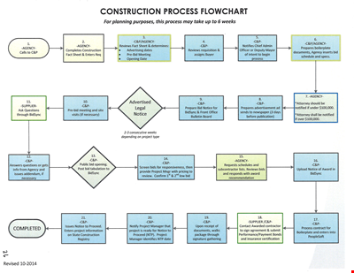
Create Professional Project Flow Charts with our Free Template
Social Event Flow Chart Template - Plan, Organize, and Execute Memorable Events
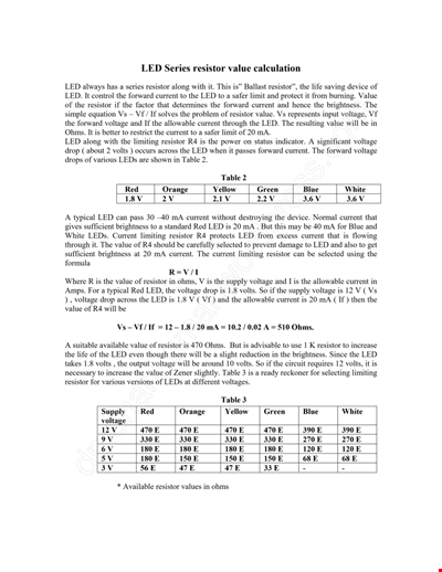
Calculation Resistor Value Chart For Led
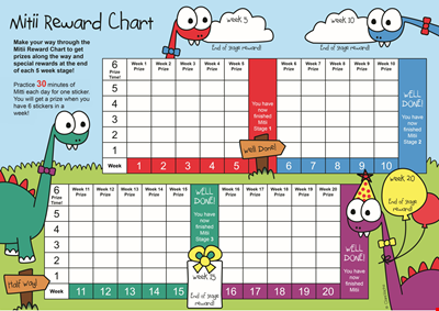
Reward Template for Kids | Printable Behavior Chart & Chore Chart

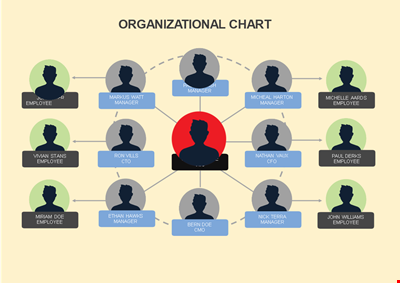
Organizational Chart Template, Editable Org Chart, Free Download

Minecraft Birthday Banner - Buy Customizable Party Decorations
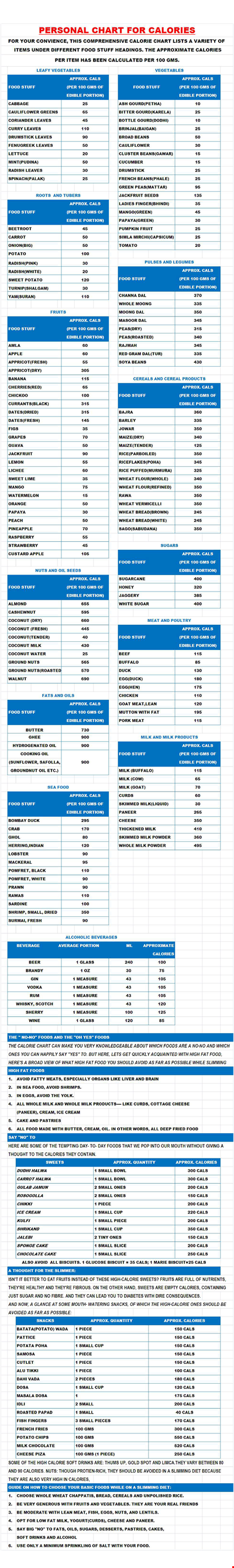
Personal Food Calorie Chart
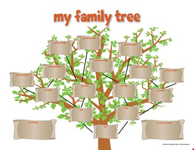
Family Tree Chart For Kids
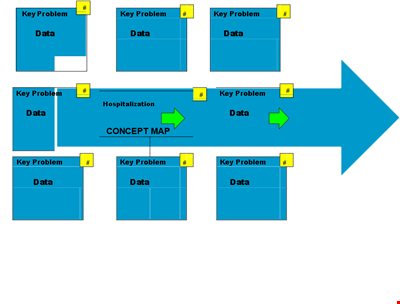
Create Organized Concepts with Our Concept Map Template - Solve Problems & Analyze Reasons
Find the Ideal Pulse Rate with Our Chord Tool
Org Chart Template Word
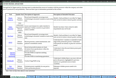
Understand and Reduce Process Variation with a Pareto Chart
Create an Organizational Chart Template - Easily Visualize Your Company Hierarchy

Free Vintage Family Tree Template
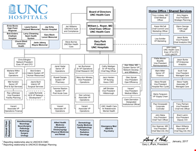
Large Hospital Organizational Chart Template - Download Now
Printable Shoe Size Chart for Kids: Find the Perfect Fit for Your Little Ones