/8365e020-7600-404c-b55b-ba650e3aaac6.png "pareto sample chart template Main Image")
Pareto Sample Chart Template
Review Rating Score
When it comes to quality management, the Pareto Chart is a valuable tool that can help businesses identify the most significant issues impacting their operations. This chart makes it easy to visualize which areas require the most attention, allowing you to prioritize and focus your resources more effectively. At BizzLibrary.com, we recognize the value of the Pareto Chart and offer a downloadable template in XLSX format to help you get started.
What is a Pareto Chart?
The Pareto Chart is a bar graph that displays the relative frequency or size of various types of events or defects in a system. It is named after Vilfredo Pareto, an Italian economist who observed that approximately 80% of wealth was owned by 20% of the population. This principle can also be applied to quality management, where it has been observed that 80% of the problems are caused by 20% of the causes.
How Does a Pareto Chart Work?
To create a Pareto Chart, you need to follow a few simple steps:
- Categorize the Defects or Events: Start by identifying the different types of defects or events that you want to measure. Group them into categories, such as product defects, customer complaints, or maintenance issues.
- Collect Data and Calculate Frequency: Collect data on each category over a specific period, such as a week or a month. Calculate the total frequency or count for each category.
- Calculate Cumulative Frequency and Percentage: Calculate the cumulative frequency and percentage for each category. The cumulative frequency is the running total of the frequency, while the percentage is the proportion of the total frequency.
- Create a Bar Chart: Plot a bar chart for each category, using the frequency as the height of the bar. Arrange the bars in order of decreasing frequency, from left to right. Include a cumulative percentage line to show the cumulative percentage for each category.
- Analyze Results and Take Action: Analyze the Pareto Chart to identify the most significant issues impacting your system. Focus your resources on the top 20% of causes or events to achieve the greatest improvement in quality and efficiency.
Get Your Pareto Chart Template
If you're looking to implement a Pareto Chart in your quality management system, then our downloadable template in XLSX format is the perfect starting point. Simply input your data and let the chart do the rest! The template includes everything you need to get started, including a ready-to-use Pareto Chart, data input fields, and a user guide.
Visit BizzLibrary.com today to download your Pareto Chart template and access a wide range of other business document templates for your organization.
Is the template content above helpful?
Thanks for letting us know!
Reviews
Assunta Flowers(8/13/2023) - GBR
Very good!!
Mohamed Elliott(8/13/2023) - DEU
I was searching for something else, but this is very good to have, thank you.
Last modified
Our Latest Blog
- A Guide to Make a Business Plan That Really Works
- The Importance of Vehicle Inspections in Rent-to-Own Car Agreements
- Setting Up Your E-mail Marketing for Your Business: The Blueprint to Skyrocketing Engagement and Sales
- The Power of Document Templates: Enhancing Efficiency and Streamlining Workflows
Template Tags
Need help?
We are standing by to assist you. Please keep in mind we are not licensed attorneys and cannot address any legal related questions.
-
Chat
Online - Email
Send a message
You May Also Like
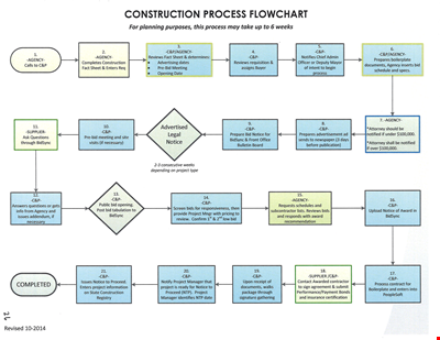
Create Professional Project Flow Charts with our Free Template
Social Event Flow Chart Template - Plan, Organize, and Execute Memorable Events
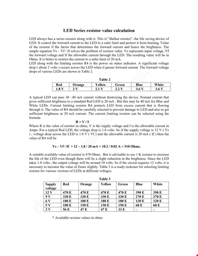
Calculation Resistor Value Chart For Led
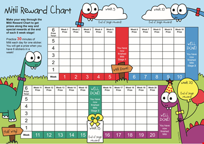
Reward Template for Kids | Printable Behavior Chart & Chore Chart

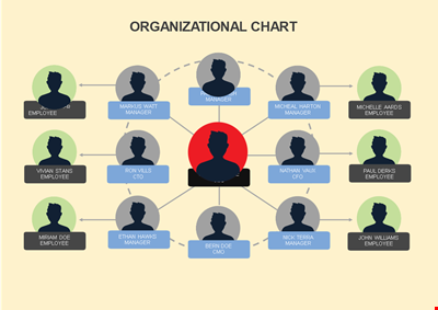
Organizational Chart Template, Editable Org Chart, Free Download

Minecraft Birthday Banner - Buy Customizable Party Decorations
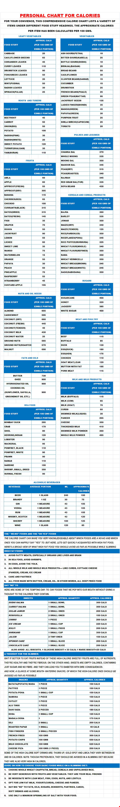
Personal Food Calorie Chart
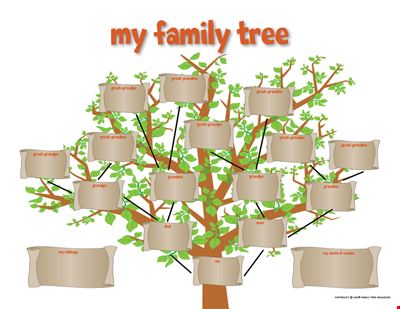
Family Tree Chart For Kids
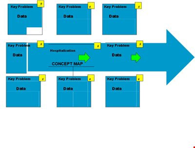
Create Organized Concepts with Our Concept Map Template - Solve Problems & Analyze Reasons
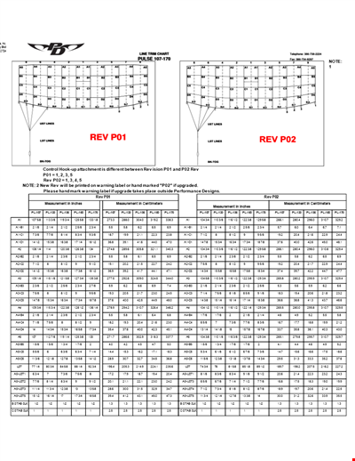
Find the Ideal Pulse Rate with Our Chord Tool
Org Chart Template Word
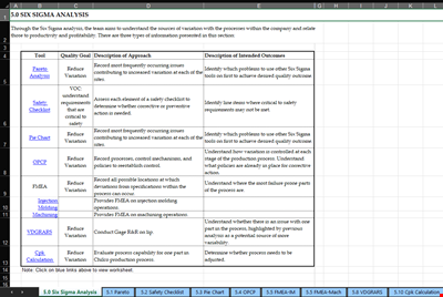
Understand and Reduce Process Variation with a Pareto Chart
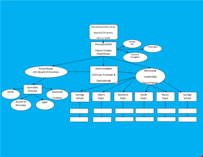
Create an Organizational Chart Template - Easily Visualize Your Company Hierarchy

Free Vintage Family Tree Template
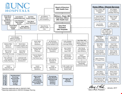
Large Hospital Organizational Chart Template - Download Now
Printable Shoe Size Chart for Kids: Find the Perfect Fit for Your Little Ones