/9a7661c8-255f-467c-a6b0-7e01301b0006.png "dynamic baseline stacked column chart excel Main Image")
Dynamic Baseline Stacked Column Chart Excel
Review Rating Score
Do you want to create a dynamic baseline stacked column chart in Excel? Look no further! BizzLibrary.com is here to help you. Our comprehensive guide will walk you through the process, allowing you to visualize and analyze your data effectively. Additionally, we provide a downloadable Excel template in XLSX format that you can use to get started right away.
What is a Dynamic Baseline Stacked Column Chart in Excel?
A dynamic baseline stacked column chart is a powerful visualization tool that allows you to display and compare data across different categories over time. It presents data in a stacked column format, where each column represents a category, and the height of the segments within the column represents the value of each subcategory.
Creating a Dynamic Baseline Stacked Column Chart
To create a dynamic baseline stacked column chart in Excel, follow these simple steps:
- Prepare your data: Organize your data in a table format, where the first column represents the index or labels, and the following columns correspond to each region or category you want to compare.
- Select your data: Select the data range that includes both your index column and the region data. Make sure to include the column headers as well.
- Insert the chart: Go to the "Insert" tab in Excel and choose the "Stacked Column" chart type. The chart will be inserted based on the selected data range.
- Edit the chart: Right-click on the chart and choose "Select Data." In the "Select Data Source" dialog box, click on the "Switch Row/Column" button to ensure that the regions appear as columns instead of rows.
- Add dynamic baseline: To add a dynamic baseline, create a new series in your data with the baseline values for each category. Go back to the "Select Data Source" dialog box and click on "Add" to add a new series. Enter the name of the series and select the range of baseline values.
- Format the chart: Customize your chart by formatting the axes, adding labels, legends, and other visual elements. Excel provides a wide range of options to help you make your chart more visually appealing and engaging.
Download the Dynamic Baseline Stacked Column Chart Template
To save time and effort, we offer a downloadable Excel template in XLSX format that you can use as a starting point for creating your dynamic baseline stacked column chart. Visit BizzLibrary.com now to access this template and many more.
Take advantage of our resources and create stunning visualizations to analyze your data effectively. Download the template today and unlock the power of dynamic baseline stacked column charts in Excel!
Is the template content above helpful?
Thanks for letting us know!
Reviews
Cleotilde Lowery(11/7/2023) - AUS
Respect for this file, it's perfect for me
Last modified
Our Latest Blog
- A Guide to Make a Business Plan That Really Works
- The Importance of Vehicle Inspections in Rent-to-Own Car Agreements
- Setting Up Your E-mail Marketing for Your Business: The Blueprint to Skyrocketing Engagement and Sales
- The Power of Document Templates: Enhancing Efficiency and Streamlining Workflows
Template Tags
Need help?
We are standing by to assist you. Please keep in mind we are not licensed attorneys and cannot address any legal related questions.
-
Chat
Online - Email
Send a message
You May Also Like
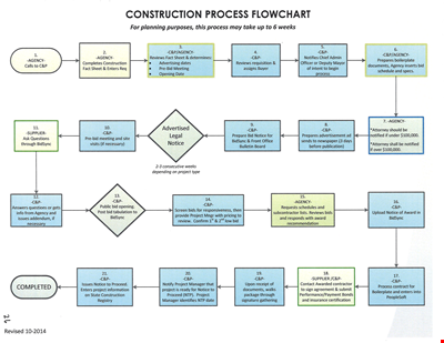
Create Professional Project Flow Charts with our Free Template
Social Event Flow Chart Template - Plan, Organize, and Execute Memorable Events
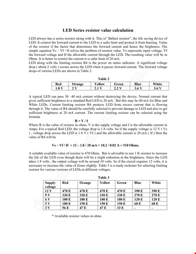
Calculation Resistor Value Chart For Led
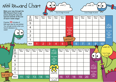
Reward Template for Kids | Printable Behavior Chart & Chore Chart

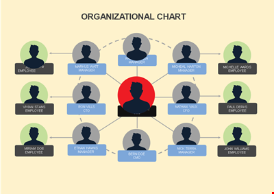
Organizational Chart Template, Editable Org Chart, Free Download

Minecraft Birthday Banner - Buy Customizable Party Decorations
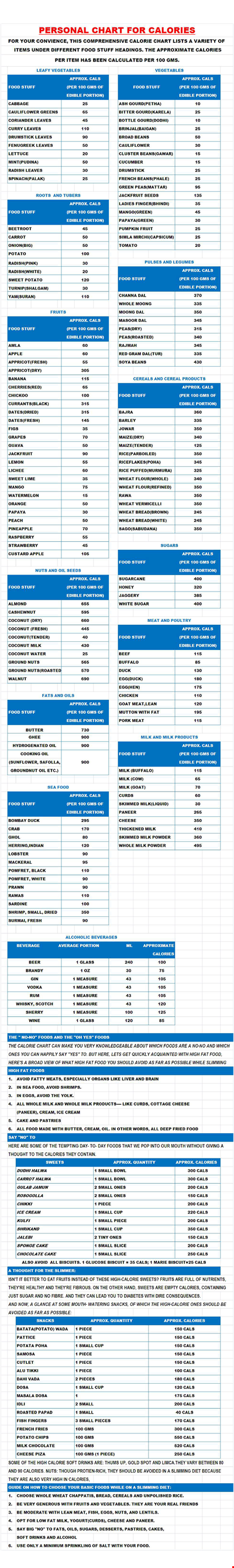
Personal Food Calorie Chart
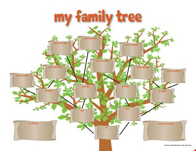
Family Tree Chart For Kids
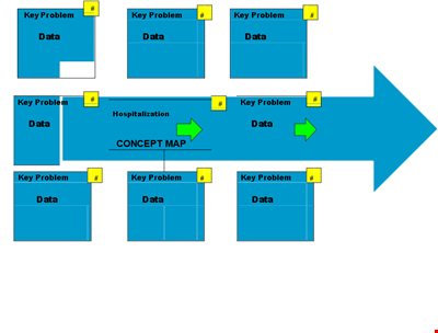
Create Organized Concepts with Our Concept Map Template - Solve Problems & Analyze Reasons
Find the Ideal Pulse Rate with Our Chord Tool
Org Chart Template Word
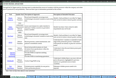
Understand and Reduce Process Variation with a Pareto Chart
Create an Organizational Chart Template - Easily Visualize Your Company Hierarchy

Free Vintage Family Tree Template
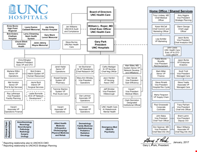
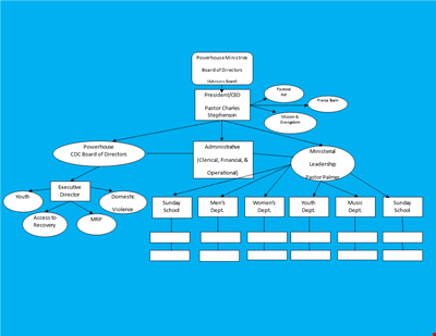
Large Hospital Organizational Chart Template - Download Now
Printable Shoe Size Chart for Kids: Find the Perfect Fit for Your Little Ones