/15e93295-19a3-4d2d-9893-df92b62a2936.png "pareto chart example: analyze categories and counts with pareto chart Main Image")
Pareto Chart Example: Analyze Categories and Counts with Pareto Chart
Review Rating Score
If you're looking to enhance your data analysis capabilities, one tool worth considering is the Pareto chart. At BizzLibrary.com, we've got you covered with a free downloadable Pareto chart example in XLSX format. Keep reading to learn more about what a Pareto chart is, how it works, and how you can use it to optimize your business performance.
What is a Pareto Chart?
A Pareto chart is a graphical tool that displays data in a prioritized order, highlighting the most significant factors contributing to a particular problem or outcome. It's based on the Pareto principle, also known as the 80/20 rule, which states that roughly 80% of effects come from 20% of causes.
The chart consists of bars that represent each category of data, arranged in descending order of their count or impact. The cumulative percentage of total counts is represented by a line graph, allowing you to easily identify the critical few categories that account for the most significant impact.
Example of a Pareto Chart
Let's say you're a business owner looking to improve customer satisfaction levels. You've conducted a survey asking customers to rate their experience in terms of various factors, such as cleanliness, customer service, price, and product quality. You've collected data from 100 respondents and want to identify the top areas of improvement.
You could use a Pareto chart to visualize the data, as shown in the downloadable example below:
Download Pareto Chart Example (XLSX)
In the chart, it's clear that the categories of "customer service" and "product quality" are the two critical factors contributing to the majority of customer dissatisfaction. It becomes evident that the focus should be on addressing these two areas to achieve the most significant impact on overall customer satisfaction levels.
How to Create a Pareto Chart
If you want to create a customized Pareto chart for your business needs, you can do so easily with the help of a spreadsheet software, such as Microsoft Excel or Google Sheets. Follow these steps:
- List your categories and their corresponding counts in a table.
- Calculate the percentage of each category's count out of the total count.
- Sort the table in descending order of the category count.
- Calculate the cumulative percentage of the count as you move down the table.
- Select both the count and cumulative percentage columns and create a bar chart. Make sure to use the secondary y-axis for the cumulative percentage.
- Add a line graph showing the cumulative percentage.
- Label the chart and the axes appropriately.
Get Your Free Pareto Chart Example
Ready to take your data analysis to the next level with a Pareto chart? Download our Pareto Chart example in XLSX format now and learn how to apply this valuable tool to your business needs. At BizzLibrary.com, we're dedicated to providing business templates, tools, and resources that optimize your success. Explore our library today and find what you need to excel!
Is the template content above helpful?
Thanks for letting us know!
Reviews
Danielle Chavez(6/28/2023) - AUS
I like the website and the template
Author. Content was provided by:
Elizabeth Davis
Elizabeth is from the sunny desert city of Phoenix, Arizona. She is thrilled to connect with professionals and like-minded individuals who share a passion for social technologies, content creation, and the exciting possibilities that AI brings to the world of social media. Her hobbies are hiking, climbing, and horse riding. Elizabeth has a master's degree in Social Technologies that she received at the ASU (Arizona State University). As a freelancer, she mostly contributes content related to IT. This includes articles on templates and forms provided by our community.
Follow Elizabeth
Last modified
Our Latest Blog
- The Importance of Vehicle Inspections in Rent-to-Own Car Agreements
- Setting Up Your E-mail Marketing for Your Business: The Blueprint to Skyrocketing Engagement and Sales
- The Power of Document Templates: Enhancing Efficiency and Streamlining Workflows
- Writing a Great Resume: Tips from a Professional Resume Writer
Template Tags
Need help?
We are standing by to assist you. Please keep in mind we are not licensed attorneys and cannot address any legal related questions.
-
Chat
Online - Email
Send a message
You May Also Like
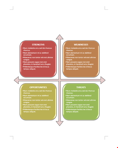
Business SWOT Analysis Template

Literary Analysis Essay Structure: HATMAT, Quote, Paragraph, Thesis Sentence
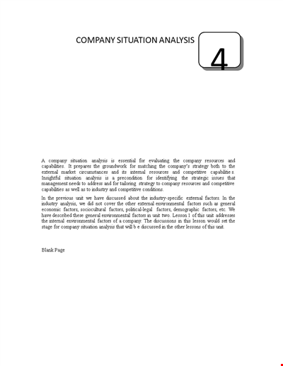
Company Situation Analysis Template - Conducting Internal and Competitive Analysis

Free Company Analysis Template - Improve Your Strategy, Analyze Stocks, and Drive Growth

Financial Analysis Template for Company Sales, Group Assets, and Ratios | Competitor Analysis

Smart Company Analysis Template - Improve your Financial Analysis with Intellidex

Service Failure Analysis Template - Analyzing System and Motor Failure with Commutator

Gap Requirements Analysis Template - Acrimas Analysis

Engineering Failure Analysis Template
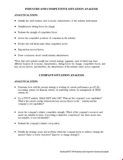
Industry & Competitive Situation Analysis

Vertical Financial Statement Analysis Example
Simple Company Analysis Template

Market Analysis Template: Get Valuable Insights for Strategic Marketing

Simple Case Analysis Template | Identify Issues, Analyze Activity

Decision Tree Algorithm Template - Efficiently Analyze Decision-Making Processes
Critical Literary Analysis Template - Analyzing and Crafting a Strong Statement