/c33cd15e-d468-4389-bf2e-d81bc04e30b4.png "learn to create quality pareto charts by category | total pareto chart Main Image")
Learn to Create Quality Pareto Charts by Category | Total Pareto Chart
Review Rating Score
If you're looking to improve the quality of your processes and increase efficiency, a Pareto Chart may be just what you need. This powerful tool can help you identify the most significant factors affecting your business and prioritize your efforts for maximum impact. At BizzLibrary.com, we offer a comprehensive Pareto Chart template that you can use to analyze your data and improve your operations.
What is a Pareto Chart?
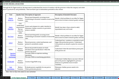
A Pareto Chart is a graphical tool used to identify and analyze the significant causes of a problem or issue in a process. It's based on the Pareto Principle, also known as the 80/20 rule, which states that roughly 80% of effects come from 20% of causes. The chart is named after Vilfredo Pareto, an Italian economist who first observed the principle while studying the distribution of wealth in society.
How Does a Pareto Chart Work?
A Pareto Chart consists of a bar graph and a line graph. The bars represent the total frequency or cost of each problem category, arranged in descending order from left to right. The line graph represents the cumulative percentage of the total frequency or cost. The chart allows you to visualize the critical issues that are causing the majority of the problems, enabling you to prioritize your efforts and allocate resources effectively.
How to Use the Pareto Chart Template
Our Pareto Chart template is a pre-formatted, ready-to-use tool that can help you create a professional and effective chart quickly and easily. Here's how to use it:
- Download the Template: Visit BizzLibrary.com and download the Pareto Chart template in XLSX format.
- Enter Your Data: Enter your data into the spreadsheet, including the categories and the total frequency or cost for each category. The template will automatically calculate the category percentage and cumulative percentage.
- Create the Chart: The template includes a pre-designed chart that you can customize to match your data and preferences. Simply select the chart and use the Chart Tools to modify the design, layout, and formatting.
- Learn from the Chart: Analyze the chart to identify the most significant problem categories and their impact. Use this information to prioritize your efforts and take action on the most critical issues.
Download Your Pareto Chart Template
Improve your quality and efficiency with our Pareto Chart template. It's an easy-to-use tool that can help you gain valuable insights into your data and enhance your decision-making capabilities. Visit BizzLibrary.com today to download your Pareto Chart template in XLSX format for free!
At BizzLibrary.com, you'll find a wide selection of business document templates, including quality control tools, financial statements, and more. Take the first step towards optimizing your business processes and download our Pareto Chart template now.
Is the template content above helpful?
Thanks for letting us know!
Reviews
Joycelyn Oneill(6/28/2023) - AUS
Thanks for providing this document
Last modified
Our Latest Blog
- The Importance of Vehicle Inspections in Rent-to-Own Car Agreements
- Setting Up Your E-mail Marketing for Your Business: The Blueprint to Skyrocketing Engagement and Sales
- The Power of Document Templates: Enhancing Efficiency and Streamlining Workflows
- Writing a Great Resume: Tips from a Professional Resume Writer
Template Tags
Need help?
We are standing by to assist you. Please keep in mind we are not licensed attorneys and cannot address any legal related questions.
-
Chat
Online - Email
Send a message
You May Also Like
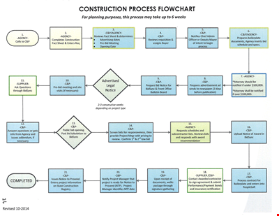
Create Professional Project Flow Charts with our Free Template
Social Event Flow Chart Template - Plan, Organize, and Execute Memorable Events
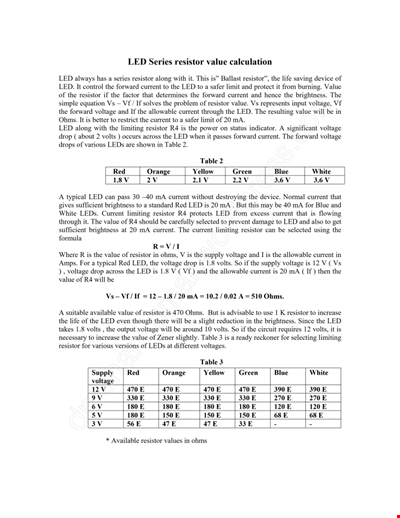
Calculation Resistor Value Chart For Led
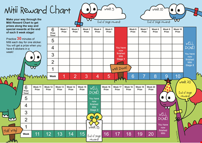
Reward Template for Kids | Printable Behavior Chart & Chore Chart

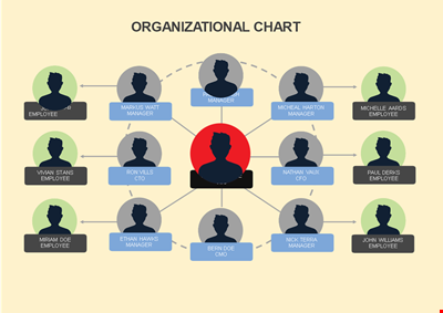
Organizational Chart Template, Editable Org Chart, Free Download

Minecraft Birthday Banner - Buy Customizable Party Decorations
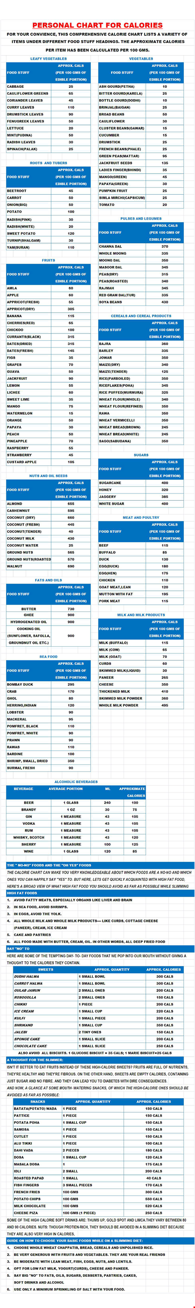
Personal Food Calorie Chart
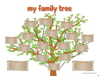
Family Tree Chart For Kids
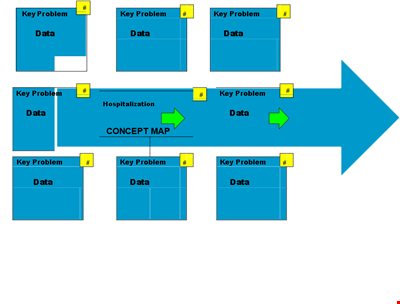
Create Organized Concepts with Our Concept Map Template - Solve Problems & Analyze Reasons
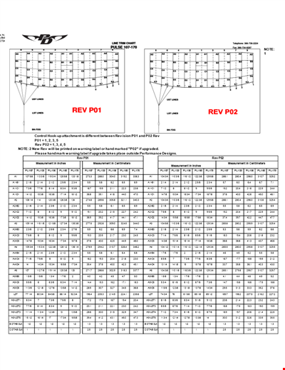
Find the Ideal Pulse Rate with Our Chord Tool
Org Chart Template Word
Understand and Reduce Process Variation with a Pareto Chart
Create an Organizational Chart Template - Easily Visualize Your Company Hierarchy

Free Vintage Family Tree Template
Large Hospital Organizational Chart Template - Download Now
Printable Shoe Size Chart for Kids: Find the Perfect Fit for Your Little Ones